
Colour in a portrait, explained simply
Colour is not decoration in a portrait. It decides where the eye goes and how the skin reads, and it is chosen before the shutter, not after.

Colour is the first thing a viewer notices in a portrait, before the pose and before the expression. It is also the easiest thing to leave to chance. I would rather make three quiet decisions before the shutter than correct a colour cast afterwards.
Start with the skin
Skin is not one colour. It has a surface tone and an undertone, and the undertone is what the frame has to work with. Warm, cool and neutral complexions all react differently to what is placed beside them.
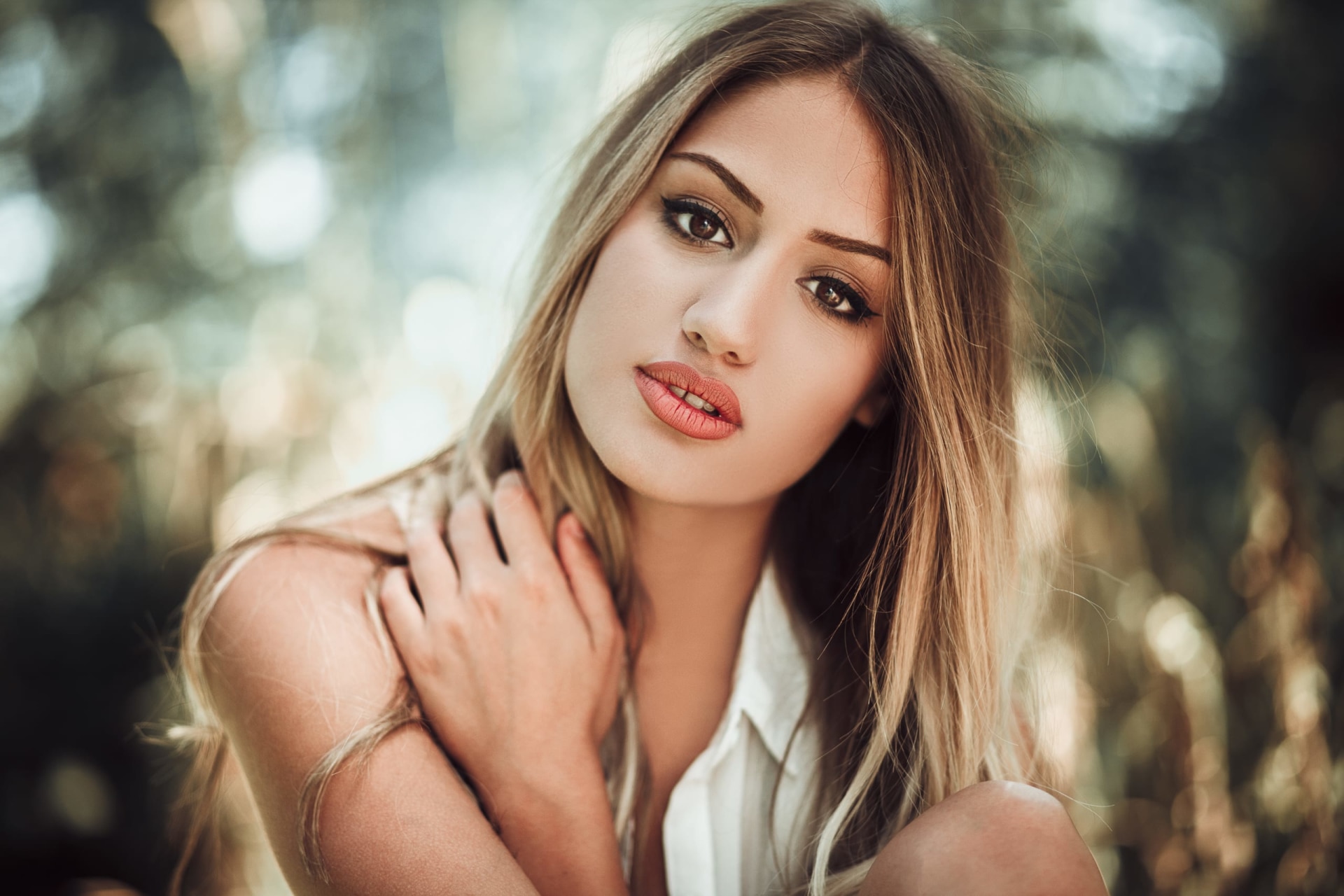
The largest coloured surface in the frame is usually the background, and it behaves like a second light source. A strong green wall throws green into the jawline. A red wall warms the shadow side of the face. Skin picks this up more than fabric or hair because light passes slightly beneath the surface before coming back.
That is why I choose the background before the outfit. A wall that fights the skin will keep fighting it in every frame. A calm wall lets the face carry the picture.
Warm and cool do different work
Colour temperature describes the colour of light, measured in Kelvin. Lower values are warmer and more amber; higher values are cooler and more blue. The eye adjusts to this constantly, which is why a white wall looks white under almost any light. The camera needs more help.
Warm light narrows the distance between people and the picture. It flatters most skin, deepens shadows and makes a street feel lived in. Cool light is quieter and more formal. In shade or under cloud it can calm a busy background, but on skin it can turn grey if white balance is left to guess.
Neither is better. The mistake is mixing them without noticing. A face lit by warm window light against a blue-shadowed wall is a decision. The same frame with the white balance somewhere in between is an accident.
Let one colour lead
A portrait needs one dominant colour, one supporting colour and, at most, one accent. When three colours compete, the eye moves between them and the face becomes the least interesting thing in the frame.
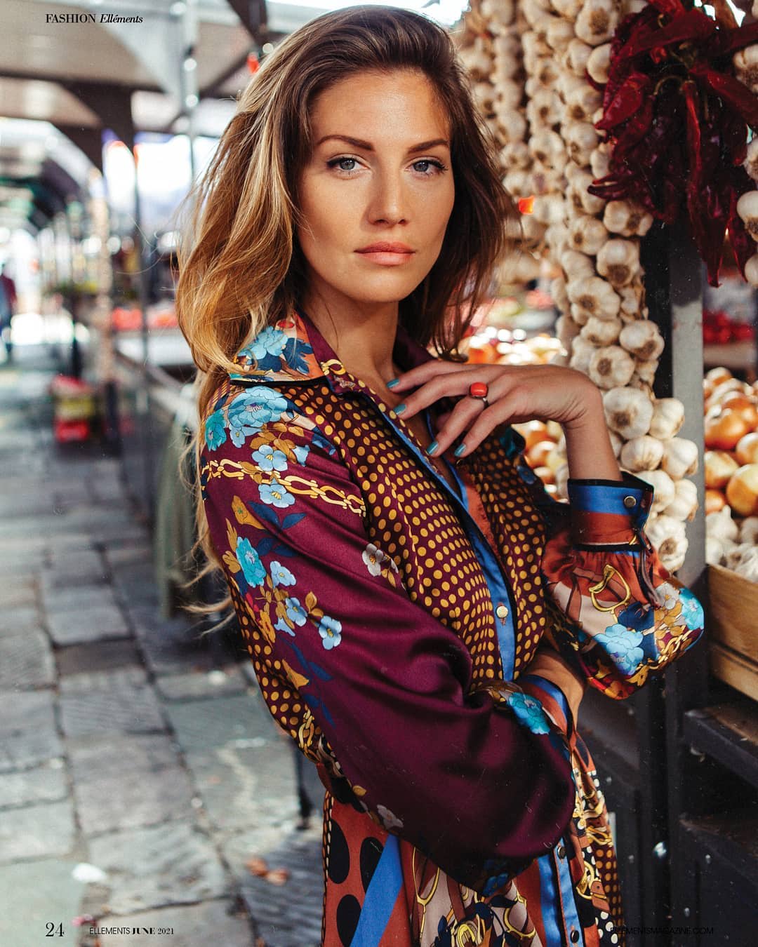
The dominant colour can come from the background, the clothing or the light itself. It does not need to be bright. A grey street with one warm coat is a palette. A green park with a red scarf is a different one. What matters is that the colours agree on which one is in charge.
Repetition helps. If the same colour appears twice — a jumper and a painted door, a scarf and a sign — the frame feels considered rather than decorated.
Opposites attract attention
Complementary colours sit opposite each other on the colour wheel: blue against orange, red against green, yellow against violet. Placed together, they make each other look stronger. That is useful when the subject needs to separate from the background, and dangerous when the background is already busy.
The classic portrait pairing is warm skin against a cooler background. It works because skin usually carries some orange, and blue sits opposite. I use it often outdoors: a warm face, a blue-grey wall, nothing else shouting.
One strong pairing is enough. Two complementary pairs in the same frame turn a portrait into a colour exercise.
The light changes the palette
The same wall is a different colour at noon, at golden hour and in the rain. Warm low sun turns stone gold. Blue hour turns it cold. Overcast light flattens everything towards grey. The palette is not fixed; it is borrowed from the hour.
Reflected colour matters too. Green foliage under a tree, a red awning, a yellow façade: each fills the shadow with its own tint. Before I place anyone, I look at what the light is bouncing off and whether that colour belongs on skin.
Mixed light is the usual culprit. Daylight from a window and tungsten from a lamp will split the face into two colours, and no amount of global white balance will fix both. Turning one source off is almost always better than correcting later.
A simple check before the shutter
Squint at the frame until the details disappear. Whatever colour remains is the colour the photograph is actually about. If it is not the face, move the subject, change the angle or remove the object that is winning.
Then check the skin at the edge of the light: neck, hands, the shadow under the jaw. That is where a colour cast shows first. One frame on the screen is enough to confirm it before the session moves on.
Editing should correct, not invent. I keep skin close to what it was and let the palette do the work. A photograph that depends on a filter for its colour will look dated sooner than one that was chosen in the street.